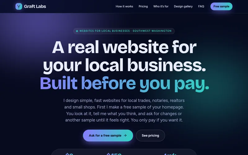
I won’t show anyone else’s sites. So I did something more useful: I took this website and showed it in five different styles, each built around a real design idea. Open any one live, and see how type, colour, grid, motion and density change the personality of the exact same page.
Honest label: every style below is Graft Labs’ own site. None of it is client work, and nobody has endorsed it.
Built for your business
Your sample is custom-built, from a named starting point.
Most samples are custom-built around your business, shaped by what I find in your business listings, social media and existing website. Each one starts from a named base style and is labeled with it, like “Base style: Quiet Studio”, so a look you like can be reproduced exactly. If one of the other styles resonates with you, you can choose it instead, or ask to see your homepage in another.
Styles are cross-trade
A base style is a design system, not a trade. A landscaper can love a look that was first shown on a realtor sample, and a notary can pick a loud, friendly one. What changes is the content: I adapt the photos, icons, copy and page sections to match your trade, so the look is borrowed and the business is yours.
Photos and illustrations swapped for your work and your trade
Icons and section types that fit what customers look for
Wording rewritten for your services and service area
Section order and calls to action tuned to how your customers decide
The five gallery styles
These are the five designs on this page. Each one is Graft Labs’ own site in a different style, and you can open each live.
Five more starting points, first drawn for a trade
My sample builder also has these base styles. Each was first drawn for one kind of business, but any of them can be adapted to yours. I won’t show anyone else’s work, so these are described here rather than displayed.
Heirloom
First drawn for notaries and professional services
Navy, cream and brass with a classical serif. Calm and trustworthy.
Workshop
First drawn for handyman and trades
Charcoal, safety yellow and kraft paper with heavy type. Sturdy and practical.
Greenhouse
First drawn for landscaping
Forest and moss greens with warm clay and soft illustration. Lush and friendly.
Sunbright
First drawn for modern landscaping and craft trades
Sun yellow, deep teal and terracotta with a bento layout. Bright and modern.
Valley Home
First drawn for realtors
Cream, brick, golden-hour gold and river blue with a warm serif. Personal and local.
Honest label: the five gallery styles are Graft Labs’ own site. The five starting points above are described, not shown, because I won’t display anyone else’s site. Nobody has endorsed any of them.
Canopy
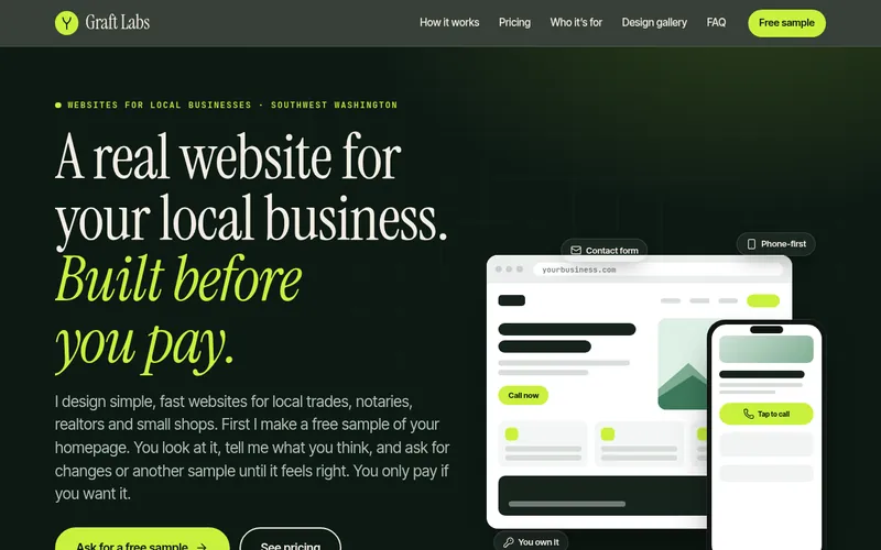
Dark editorial. Confident, a little cinematic.
#0d1a14
#f3eee3
#c8f23c
#1d3328
Type pairing
Instrument Serif for display, set big with italic emphasis, over Inter Tight for reading and JetBrains Mono for small labels. A high-contrast serif next to a neutral grotesque reads premium without getting precious; the mono adds a technical note.
Color system
Near-black green, warm paper cream and one electric lime. Lime is used only for the action and the key word, so the eye always knows where to go.
Layout & grid
Asymmetric split hero with a layered browser-and-phone mockup, then alternating dark and paper bands to set pacing.
Motion
Staggered line reveals, a mockup that assembles itself, a slow ticker and scroll-linked fades where the browser supports them. All off for reduced-motion users.
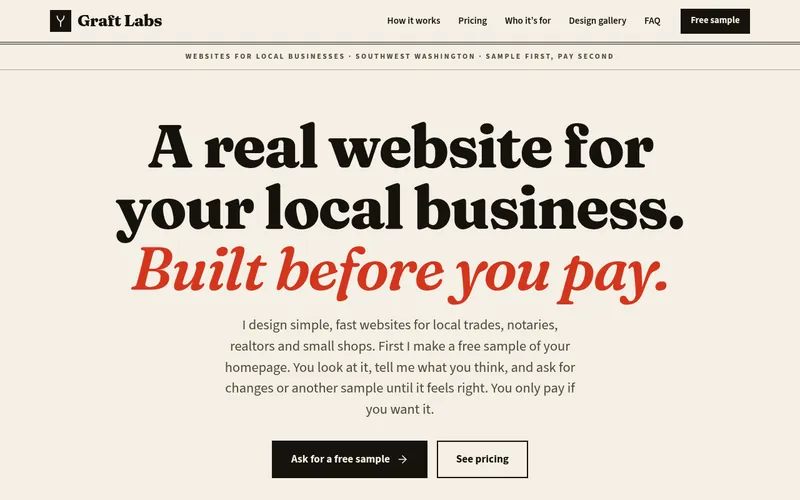
Print-inspired. Trustworthy, readable, a bit old-school.
#f4efe4
#16120d
#d3361f
#d9d0bd
Type pairing
Fraunces, a “wonky” old-style serif, for headlines with Source Sans 3 for text. Serif-led pairing borrows the authority of newsprint, which suits professions where trust is the product.
Color system
Warm newsprint paper, true ink black and a single vermilion red used like a spot-colour second ink, never as a fill across big areas.
Layout & grid
Masthead-style centred hero, hairline column rules, numbered dispatches instead of cards. A 12-column grid is made visible through the rules.
Motion
Almost none: underlines draw in on hover and the page fades in. Print is calm, so the motion stays calm.
Density
Higher. More text per screen, with the rules and hierarchy doing the organising.
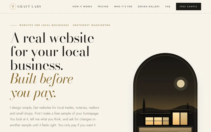
Luxury editorial. Ivory, charcoal and brass, with room to breathe.
#f7f3ea
#1c1a17
#8c6d34
#eee7d8
Type pairing
Bodoni Moda, a high-contrast didone, for display set light and large with italic emphasis, over Jost, a light geometric sans, for reading. Hairline serifs and tracked small capitals are the language of fashion and fine-property magazines, and they signal quiet confidence rather than volume.
Color system
Warm ivory, deep warm charcoal and one muted brass. Brass appears only in thin rules, small labels and the italic word in a headline, the way gilt edges a page. A restrained palette lets photography carry the colour.
Layout & grid
A tall arched window on the hero, hairline rules instead of boxes, wide margins and a single-column editorial rhythm. Full-width charcoal bands slow the pace between ivory sections. A listing-led site would put full-bleed photography in the arch.
Motion
Slow fades only, 1.5 to 2.5 seconds, with no sliding, bouncing or scaling. Links draw a thin brass line underneath. Everything is off for reduced-motion visitors.
Density
Low. Few elements per screen and a great deal of negative space, so each one feels considered.
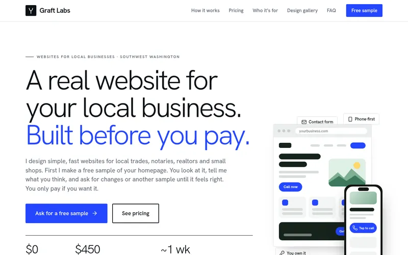
Hanken Grotesk only, in light and medium weights. A single family at one size ladder is the classic Swiss approach: hierarchy from scale and weight, not from more fonts.
Color system
White, a cool grey scale and one ultramarine blue. A restrained system makes the content, and the price, the loudest thing on the page.
Layout & grid
Strict 12-column grid, a left rail of small labels, big headlines pushed into the grid and lots of white space.
Motion
Slow, subtle fades and a line that draws under the active item. Nothing bounces.
Bricolage Grotesque for characterful, slightly condensed headlines with Figtree for body text. A display face with some personality keeps dark gradient pages from feeling generic.
Color system
Deep navy with soft violet and teal gradients and glassy translucent panels. Glow is saved for the main call to action so it works as the focal point.
Layout & grid
Centred hero over a slow-moving gradient field, frosted-glass cards in a bento-style grid.
Motion
A drifting aurora background, soft hover glows and parallax-free reveals. Motion is slow and ambient.